
Back to top
Evaluating and redesigning the national NHS leadership platform to improve clarity and discoverability
Background: Gwella is the national leadership and management portal offering free learning and development opportunities, alongside curated resources, for NHS Wales staff.
Goal: Evaluate and improve the user experience of the platform, following a 2025 redesign, focusing on navigation clarity, content discoverability, and mobile usability.
Solution: A wholesale redesign of the platform’s information architecture, visual design, homepage hierarchy, and navigation labels, supported by user testing to validate improvements before implementation.
Product
- Gwella - NHS Wales Leadership Platform
Role
- UX Researcher
- UX Designer
- UI/Visual Designer
- Workshop Facilitator
Tools
- Canva
- Google Analytics
- MS Forms
Define: What the data revealed
A redesign of the homepage was launched last year to improve navigation and content
discoverability. An evaluation of this design was ordered to understand the effectiveness and impact of the changes.
I conducted a comprehensive evaluation using four research methods:
- Analytics review - Analysed one year of Google Analytics data to compare user behaviour before and after the redesign.
- Heuristic evaluation - Recruited five internal evaluators to complete representative tasks, assess key interface elements, and document usability issues. Findings were synthesised into a prioritised recommendations list.
- System Usability Scale (SUS) & Single Ease Question (SEQ) - Eleven participants across five NHS organisations completed structured tasks, rated task ease, and responded to a 10-item SUS survey to measure perceived usability.
“I found locating specific Health Board information more difficult.”
SEQ comment about finding employer-specific training
“Too many clicks - you can get lost easily.”
Heuristic Evaluator about finding leadership programme webpage
33% fewer users reached the Resources Hub.
Analytics review
68.9 SUS Score
68.9 score out of 100 is considered ‘average’
Key insights
- Users reported increased confidence navigating the platform, though many were still unsure where to begin.
- Overall discoverability improved; however, changes in labelling reduced the visibility of some hubs.
- Users are broadly satisfied and confident but not yet delighted by the experience of using the platform.
- Engagement levels have remained stable across most platform areas post-redesign.
Ideate: Reorganising a platform
After reviewing the evaluation findings, I started to translate evaluation insights into tangible design improvements.
- Prioritisation workshop - I presented all the insights and report recommendations to the team and we collectively applied a simple priority scale score to each recommendation and assess which recommendations we wouldn’t be taking forward at this stage.
- Card Sorting Workshop - I led this workshop with my team to organise the different topics and areas of the platform into clearer and more logical groups. This resulted in a new content architecture of the platform and navigation structure for the homepage.
Card sorting exercise for homepage information architecture.
Prototype: Building for clarity and familiarity
Utilising the evaluation recommendations and the new information architecture, I developed a prototype focused on improving navigation clarity and reducing friction.
I started with defining the layout and content structure by building of a set of wireframes:
- Homepage - A full redesign that made navigation and discoverability simpler.
- New webpage archetypes - A set of 4 webpage templates that all existing content can fit in, ensuring consistency across the whole platform.
Wireframe of new homepage
I then created a mid-fidelity prototype that simulated the final product and allowed us to test and refine the design before development.
The prototypes included a full redesign of the homepage and a set of webpage archetypes that structure all webpages into clear and predictable format.
The prototype introduced several key improvements, focusing on:
- Clearer navigation labels
- A mobile-first layout
- A stronger homepage content hierarchy
Homepage as it looked when evaluated
Homepage with improvements integrated
Insight 1
Menu not reflecting content priority such as development opportunities and resources hidden and corporate and secondary content prioritised
→
Improvement 1
Navigation menu reflecting new information architecture organising content into a ‘What, Why, How’ model
Insight 2
Lack of clear entry way into leadership development opportunities and overstimulation created by two auto-play videos with outdated promo
→
Improvement 2
Hero section signposting to new ‘Leadership Pathways’ webpage and video replaced by photo of NHS staff with role diversity
Insight 3
Poor labelling, low position of webpages dramatically affecting discovery, and confusion around what each section contains
→
Improvement 3
Featured section re-done containing all key webpages of the platform, with improved labelling and micro text for better clarity
Insight 4
Time-sensitive opportunities being missed because they were not visible from the homepage
→
Improvement 4
‘Open for Applications’ section introduced for better visibility of leadership programmes available to apply
Insight 5
Banner-led news section format with four news entries prioritised visual volume over meaning, giving users no sufficient context to judge relevance before clicking.
→
Improvement 5
News section reduced to a single, description-led entry
Test: Putting the design in front of NHS staff
I led user testing to validate the prototype before implementation.
Five participants from diverse roles took part in semi-structured usability testing sessions. Participants completed a series of tasks while thinking aloud, allowing the researchers to observe their behaviour and understand their expectations and decision-making.
Key Insights
The testing showed that the redesigned webpages were generally clear and user-centred:
- Participants were consistently able to articulate the webpage’s purpose, locate key information, and understand how content applied to their roles.
- The information density felt manageable, and content was perceived as relevant and actionable.
- Structural elements such as clear headings, summaries, and role level-based structure supported scanning and comprehension.
“What’s lovely is it’s not corporate… This is about health. It’s about NHS.”
About the design of the homepage
“This very medical [hero] image. Would prefer a more inclusive image.”
About the hero image of the homepage
Most pain points identified were minor refinements rather than structural problems. Key opportunities for improvement included:
- Reducing ambiguity in some navigation labels
- Improving the clarity of the homepage’s first impression
- Increasing user confidence when choosing where to click
Iterate: From feedback to fixes
Continuing with the homepage example, the following recommendations were integrated in the final version:
- Imagery - Participants wanted authentic photos of NHS Wales staff in uniforms rather than stock imagery, and asked for greater diversity of roles, from clinical to corporate, so all users feel represented and the content feels inclusive rather than leaning towards a specific direction.
- Navigation labels - Some labels still caused confusion. For example, "Explore your pathway" felt too similar to general browsing, giving users no clear signal it was the main entry point into the platform. It was renamed to "Find your pathway" to better communicate its purpose.
Homepage prototype used during user testing
Homepage final version with user testing insights integrated
Outcome
- The final prototype was validated, and approved by stakeholders.
- The webpages are currently being developed and will be launched in the upcoming months.
Lessons learned
What worked
- A triangulated research approach strengthened the reliability of insights and gave me confidence in the findings moving into the next design stages.
- The initial redesign introduced meaningful improvements (navigation labels, mobile-first layout, content hierarchy) that were later refined through additional user testing and iteration.
What didn’t go as expected
- Recruiting a larger group of clinical participants proved more challenging than anticipated without the support from a variety of stakeholders.
- A mobile-first approach was essential, as the target audience has limited access to desktop devices. However, tool limitations meant the mobile experience could not be evaluated during this phase.
What I learned
- Triangulated research strengthened stakeholder confidence by showing that design decisions are supported by robust and consistent evidence.
- Effective homepage design is primarily about orientation and clear pathways, not just visual aesthetics.
- Clear, jargon-free labelling is essential for helping users quickly understand and navigate content.
What I’d do differently next time
- Collaborate with key stakeholders earlier in the recruitment process to ensure access to a wider range of clinical participants, rather than relying on a smaller pool late in the project.
- Ensure usability testing assesses mobile and desktop experiences separately to ensure both are fully tested
Leadership programme webpage
Next case study


Back to top
Define
Ideate
Prototype
Test
Iterate
Evaluating and redesigning the national NHS leadership platform to improve clarity and discoverability
Background: Gwella is the national leadership and management portal offering free learning and development opportunities, alongside curated resources, for NHS Wales staff.
Goal: Evaluate and improve the user experience of the platform, following a 2025 redesign, focusing on navigation clarity, content discoverability, and mobile usability.
Solution: A wholesale redesign of the platform’s information architecture, visual design, homepage hierarchy, and navigation labels, supported by user testing to validate improvements before implementation.
Product
- Gwella - NHS Wales Leadership Platform
Role
- UX Researcher
- UX Designer
- UI/Visual Designer
- Workshop Facilitator
Tools
- Canva
- Google Analytics
- MS Forms
Define: What the data revealed
A redesign of the homepage was launched last year to improve navigation and content
discoverability. An evaluation of this design was ordered to understand the effectiveness and impact of the changes.
I conducted a comprehensive evaluation using four research methods:
- Analytics review - Analysed one year of Google Analytics data to compare user behaviour before and after the redesign.
- Heuristic evaluation - Recruited five internal evaluators to complete representative tasks, assess key interface elements, and document usability issues. Findings were synthesised into a prioritised recommendations list.
- System Usability Scale (SUS) & Single Ease Question (SEQ) - Eleven participants across five NHS organisations completed structured tasks, rated task ease, and responded to a 10-item SUS survey to measure perceived usability.
“I found locating specific Health Board information more difficult.”
SEQ comment about finding employer-specific training
“Too many clicks - you can get lost easily.”
Heuristic Evaluator about finding leadership programme webpage
33% fewer users reached the Resources Hub.
Analytics review
68.9 SUS Score
68.9 score out of 100 is considered ‘average’
Key insights
- Users reported increased confidence navigating the platform, though many were still unsure where to begin.
- Overall discoverability improved; however, changes in labelling reduced the visibility of some hubs.
- Users are broadly satisfied and confident but not yet delighted by the experience of using the platform.
- Engagement levels have remained stable across most platform areas post-redesign.
Ideate: Reorganising a platform
After reviewing the evaluation findings, I started to translate evaluation insights into tangible design improvements.
- Prioritisation workshop - I presented all the insights and report recommendations to the team and we collectively applied a simple priority scale score to each recommendation and assess which recommendations we wouldn’t be taking forward at this stage.
- Card Sorting Workshop - I led this workshop with my team to organise the different topics and areas of the platform into clearer and more logical groups. This resulted in a new content architecture of the platform and navigation structure for the homepage.
Card sorting exercise for homepage information architecture.
Prototype: Building for clarity and familiarity
Utilising the evaluation recommendations and the new information architecture, I developed a prototype focused on improving navigation clarity and reducing friction.
I started with defining the layout and content structure by building of a set of wireframes:
- Homepage - A full redesign that made navigation and discoverability simpler.
- New webpage archetypes - A set of 4 webpage templates that all existing content can fit in, ensuring consistency across the whole platform.
Wireframe of new homepage
I then created a mid-fidelity prototype that simulated the final product and allowed us to test and refine the design before development.
The prototypes included a full redesign of the homepage and a set of webpage archetypes that structure all webpages into clear and predictable format.
The prototype introduced several key improvements, focusing on:
- Clearer navigation labels
- A mobile-first layout
- A stronger homepage content hierarchy
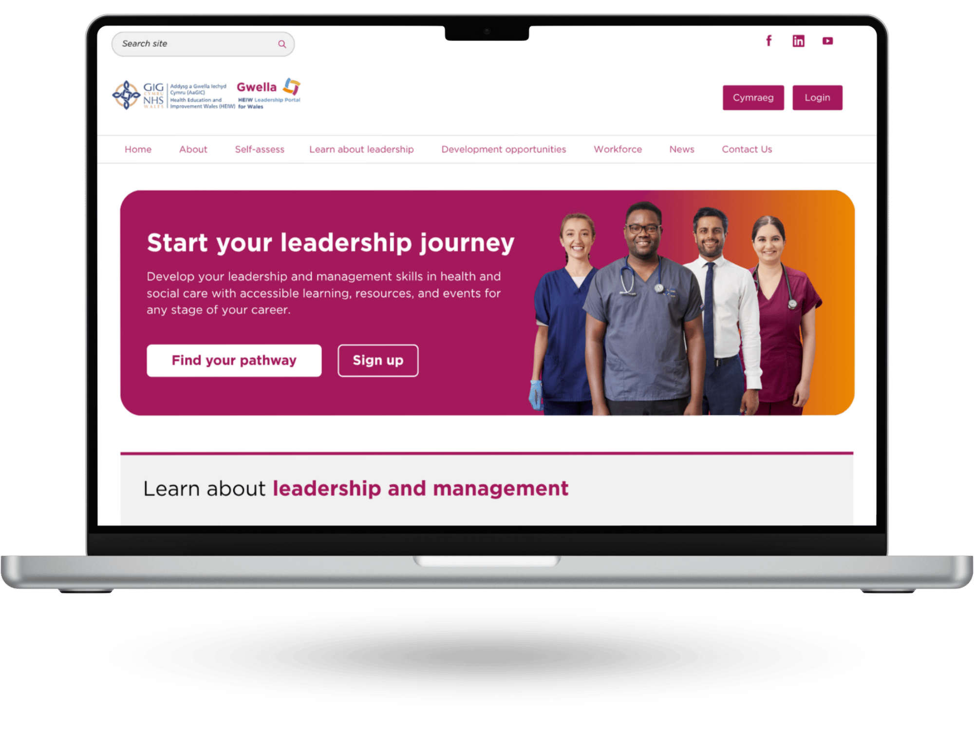
Homepage as it looked when evaluated
Homepage with improvements integrated
Insight
→
Improvement
Menu not reflecting content priority such as development opportunities and resources hidden and corporate and secondary content prioritised
→
Navigation menu reflecting new information architecture organising content into a ‘What, Why, How’ model
Lack of clear entry way into leadership development opportunities and overstimulation created by two auto-play videos with outdated promo
→
Hero section signposting to new ‘Leadership Pathways’ webpage and video replaced by photo of NHS staff with role diversity
Poor labelling, low position of webpages dramatically affecting discovery, and confusion around what each section contains
→
Featured section re-done containing all key webpages of the platform, with improved labelling and micro text for better clarity
Time-sensitive opportunities being missed because they were not visible from the homepage
→
‘Open for Applications’ section introduced for better visibility of leadership programmes available to apply
Banner-led news section format with four news entries prioritised visual volume over meaning, giving users no sufficient context to judge relevance before clicking.
→
News section reduced to a single, description-led entry
Test: Putting the design in front of NHS staff
I led user testing to validate the prototype before implementation.
Five participants from diverse roles took part in semi-structured usability testing sessions. Participants completed a series of tasks while thinking aloud, allowing the researchers to observe their behaviour and understand their expectations and decision-making.
Key Insights
The testing showed that the redesigned webpages were generally clear and user-centred:
Page of user testing report about the homepage
- Participants were consistently able to articulate the webpage’s purpose, locate key information, and understand how content applied to their roles.
- The information density felt manageable, and content was perceived as relevant and actionable.
- Structural elements such as clear headings, summaries, and role level-based structure supported scanning and comprehension.
“What’s lovely is it’s not corporate… This is about health. It’s about NHS.”
About the design of the homepage
“This very medical [hero] image. Would prefer a more inclusive image.”
About the hero image of the homepage
Most pain points identified were minor refinements rather than structural problems. Key opportunities for improvement included:
- Reducing ambiguity in some navigation labels
- Improving the clarity of the homepage’s first impression
- Increasing user confidence when choosing where to click
Iterate: From feedback to fixes
Continuing with the homepage example, the following recommendations were integrated in the final version:
- Imagery - Participants wanted authentic photos of NHS Wales staff in uniforms rather than stock imagery, and asked for greater diversity of roles, from clinical to corporate, so all users feel represented and the content feels inclusive rather than leaning towards a specific direction.
- Navigation labels - Some labels still caused confusion. For example, "Explore your pathway" felt too similar to general browsing, giving users no clear signal it was the main entry point into the platform. It was renamed to "Find your pathway" to better communicate its purpose.
Homepage prototype used during user testing
Homepage final version with user testing insights integrated
Outcome
- The final prototype was validated, and approved by stakeholders.
- The webpages are currently being developed and will be launched in the upcoming months.
Lessons learned
What worked
- A triangulated research approach strengthened the reliability of insights and gave me confidence in the findings moving into the next design stages.
- The initial redesign introduced meaningful improvements (navigation labels, mobile-first layout, content hierarchy) that were later refined through additional user testing and iteration.
What didn’t go as expected
- Recruiting a larger group of clinical participants proved more challenging than anticipated without the support from a variety of stakeholders.
- A mobile-first approach was essential, as the target audience has limited access to desktop devices. However, tool limitations meant the mobile experience could not be evaluated during this phase.
What I learned
- Triangulated research strengthened stakeholder confidence by showing that design decisions are supported by robust and consistent evidence.
- Effective homepage design is primarily about orientation and clear pathways, not just visual aesthetics.
- Clear, jargon-free labelling is essential for helping users quickly understand and navigate content.
What I’d do differently next time
- Collaborate with key stakeholders earlier in the recruitment process to ensure access to a wider range of clinical participants, rather than relying on a smaller pool late in the project.
- Ensure usability testing assesses mobile and desktop experiences separately to ensure both are fully tested
Leadership programme webpage
Next case study
Back to top
Define
Ideate
Prototype
Test
Iterate
Evaluating and redesigning the national NHS leadership platform to improve clarity and discoverability
Background: Gwella is the national leadership and management portal offering free learning and development opportunities, alongside curated resources, for NHS Wales staff.
Goal: Evaluate and improve the user experience of the platform, following a 2025 redesign, focusing on navigation clarity, content discoverability, and mobile usability.
Solution: A wholesale redesign of the platform’s information architecture, visual design, homepage hierarchy, and navigation labels, supported by user testing to validate improvements before implementation.
Product
- Gwella - NHS Wales Leadership Platform
Role
- UX Researcher
- UX Designer
- UI/Visual Designer
- Workshop Facilitator
Tools
- Canva
- Google Analytics
- MS Forms
Define: What the data revealed
A redesign of the homepage was launched last year to improve navigation and content
discoverability. An evaluation of this design was ordered to understand the effectiveness and impact of the changes.
I conducted a comprehensive evaluation using four research methods:
- Analytics review - Analysed one year of Google Analytics data to compare user behaviour before and after the redesign.
- Heuristic evaluation - Recruited five internal evaluators to complete representative tasks, assess key interface elements, and document usability issues. Findings were synthesised into a prioritised recommendations list.
- System Usability Scale (SUS) & Single Ease Question (SEQ) - Eleven participants across five NHS organisations completed structured tasks, rated task ease, and responded to a 10-item SUS survey to measure perceived usability.
“I found locating specific Health Board information more difficult.”
SEQ comment about finding employer-specific training
“Too many clicks - you can get lost easily.”
Heuristic Evaluator about finding leadership programme webpage
33% fewer users reached the
Resources Hub.
Analytics review
68.9 SUS Score
68.9 score out of 100 is considered ‘average’
Key insights
- Users reported increased confidence navigating the platform, though many were still unsure where to begin.
- Overall discoverability improved; however, changes in labelling reduced the visibility of some hubs.
- Users are broadly satisfied and confident but not yet delighted by the experience of using the platform.
- Engagement levels have remained stable across most platform areas post-redesign.
Ideate: Reorganising a platform
After reviewing the evaluation findings, I started to translate evaluation insights into tangible design improvements.
- Prioritisation workshop - I presented all the insights and report recommendations to the team and we collectively applied a simple priority scale score to each recommendation and assess which recommendations we wouldn’t be taking forward at this stage.
- Card Sorting Workshop - I led this workshop with my team to organise the different topics and areas of the platform into clearer and more logical groups. This resulted in a new content architecture of the platform and navigation structure for the homepage.
Card sorting exercise for homepage information architecture.
Prototype: Building for clarity and familiarity
Utilising the evaluation recommendations and the new information architecture, I developed a prototype focused on improving navigation clarity and reducing friction.
I started with defining the layout and content structure by building of a set of wireframes:
- Homepage - A full redesign that made navigation and discoverability simpler.
- New webpage archetypes - A set of 4 webpage templates that all existing content can fit in, ensuring consistency across the whole platform.
I then created a mid-fidelity prototype that simulated the final product and allowed us to test and refine the design before development.
Wireframe of new homepage
The prototypes included a full redesign of the homepage and a set of webpage archetypes that structure all webpages into clear and predictable format.
The prototype introduced several key improvements, focusing on:
- Clearer navigation labels
- A mobile-first layout
- A stronger homepage content hierarchy
Homepage as it looked when evaluated
Homepage with improvements integrated
Insight
→
Improvement
Menu not reflecting content priority such as development opportunities and resources hidden and corporate and secondary content prioritised
→
Navigation menu reflecting new information architecture organising content into a ‘What, Why, How’ model
Lack of clear entry way into leadership development opportunities and overstimulation created by two auto-play videos with outdated promo
→
Hero section signposting to new ‘Leadership Pathways’ webpage and video replaced by photo of NHS staff with role diversity
Poor labelling, low position of webpages dramatically affecting discovery, and confusion around what each section contains
→
Featured section re-done containing all key webpages of the platform, with improved labelling and micro text for better clarity
Time-sensitive opportunities being missed because they were not visible from the homepage
→
‘Open for Applications’ section introduced for better visibility of leadership programmes available to apply
Banner-led news section format with four news entries prioritised visual volume over meaning, giving users no sufficient context to judge relevance before clicking.
→
News section reduced to a single, description-led entry
Test: Putting the design in front of NHS staff
I led user testing to validate the prototype before implementation.
Five participants from diverse roles took part in semi-structured usability testing sessions. Participants completed a series of tasks while thinking aloud, allowing the researchers to observe their behaviour and understand their expectations and decision-making.
Key Insights
The testing showed that the redesigned webpages were generally clear and user-centred:
- Participants were consistently able to articulate the webpage’s purpose, locate key information, and understand how content applied to their roles.
- The information density felt manageable, and content was perceived as relevant and actionable.
- Structural elements such as clear headings, summaries, and role level-based structure supported scanning and comprehension.
“What’s lovely is it’s not corporate… This is about health. It’s about NHS.”
About the design of the homepage
“This very medical [hero] image. Would prefer a more inclusive image.”
About the hero image of the homepage
Most pain points identified were minor refinements rather than structural problems. Key opportunities for improvement included:
- Reducing ambiguity in some navigation labels
- Improving the clarity of the homepage’s first impression
- Increasing user confidence when choosing where to click
Iterate: From feedback to fixes
Continuing with the homepage example, the following recommendations were integrated in the final version:
- Imagery - Participants wanted authentic photos of NHS Wales staff in uniforms rather than stock imagery, and asked for greater diversity of roles, from clinical to corporate, so all users feel represented and the content feels inclusive rather than leaning towards a specific direction.
- Navigation labels - Some labels still caused confusion. For example, "Explore your pathway" felt too similar to general browsing, giving users no clear signal it was the main entry point into the platform. It was renamed to "Find your pathway" to better communicate its purpose.
Homepage prototype used during user testing
Homepage final version with user testing insights integrated
Outcome
- The final prototype was validated, and approved by stakeholders.
- The webpages are currently being developed and will be launched in the upcoming months.
Lessons learned
What worked
- A triangulated research approach strengthened the reliability of insights and gave me confidence in the findings moving into the next design stages.
- The initial redesign introduced meaningful improvements (navigation labels, mobile-first layout, content hierarchy) that were later refined through additional user testing and iteration.
What didn’t go as expected
- Recruiting a larger group of clinical participants proved more challenging than anticipated without the support from a variety of stakeholders.
- A mobile-first approach was essential, as the target audience has limited access to desktop devices. However, tool limitations meant the mobile experience could not be evaluated during this phase.
What I learned
- Triangulated research strengthened stakeholder confidence by showing that design decisions are supported by robust and consistent evidence.
- Effective homepage design is primarily about orientation and clear pathways, not just visual aesthetics.
- Clear, jargon-free labelling is essential for helping users quickly understand and navigate content.
What I’d do differently next time
- Collaborate with key stakeholders earlier in the recruitment process to ensure access to a wider range of clinical participants, rather than relying on a smaller pool late in the project.
- Ensure usability testing assesses mobile and desktop experiences separately to ensure both are fully tested
Leadership programme webpage
Next case study